7 Web Design Tips for Education Sites
Your website is your most important digital asset. For many of your potential students, it’s their first interaction with your school. It not only “sells” your school, for many institutions, it’s also the platform prospects use to apply for enrollment. The website is also an important resource for your current students, alumni, professors, community leaders and all others who go to your website for news, events and information related to your institution.
When your higher education website isn’t pristine (ADA-compliant, engaging, consistent), you’re missing the mark with potential students. These tips will help you grab the attention of prospective students and make sure you put your best foot forward.
Here are 7 tips for making your higher education website shine:
1. Clearly and consistently identify who you are
Your website should reflect your brand. Ideally, every page includes identifying factors such as your logo and school colors – from the high-level university pages to each course listing. A uniform brand throughout your education website shows the user that you’re committed to providing them the best experience possible. Creating a brand style guide is a great place to start, so everyone in your organization knows how to talk about your institution, and can apply it to their daily work going forward.
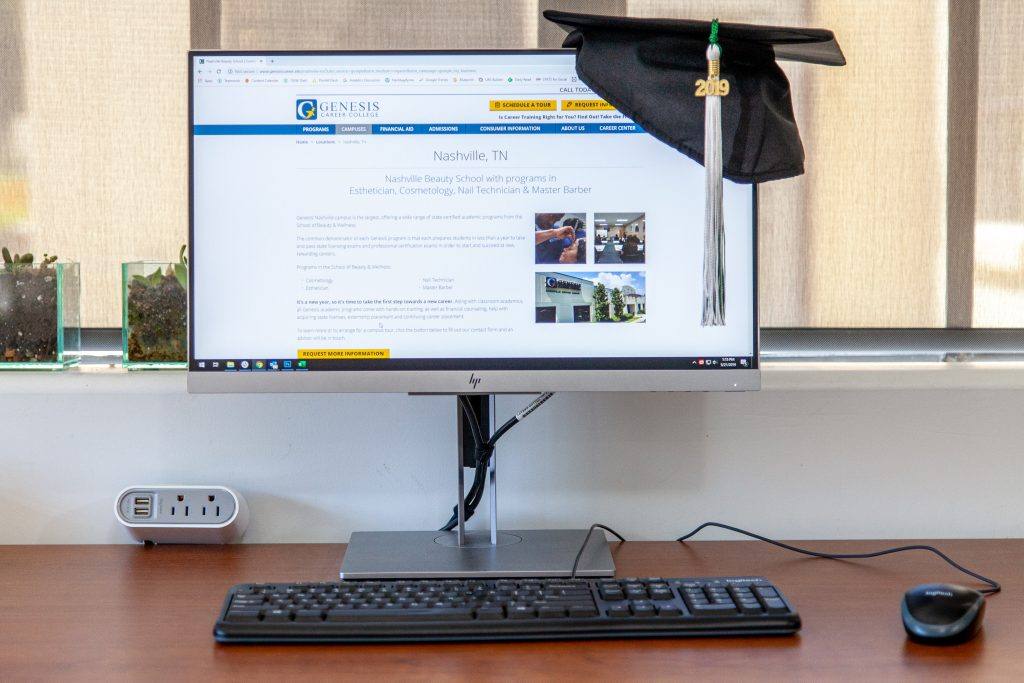
2. Use supporting images to reflect your values and culture
A picture is worth a thousand words. Images reflect the experiences and aspirations of your students, faculty, staff and the overall environment of the campus. Invest in good photography and you’ll be able to use those assets for years to come. Images should have a style and consistency to them, so they look uniform from page to page, without being repetitive. Shy away from stock images and let your school spirit shine by including real people that reflect your institution.
3. Highlight your strengths
What makes your college or university great, or different from the competition? Make sure these differentiating factors are called out and easy to find. They matter. Consider creating specific pages centered on awards and accreditations you’ve earned, or other aspects of your organization that you’re proud of. Incorporating these into the website design will boost their visibility.
4. Show prospective students when and how to apply
When it comes to web design for education sites, you don’t want to bury the important information. If you’ve hidden your admissions page away in an isolated corner of your website, your target audience (prospective students) can’t easily apply. The forms should be easy to find and easy to use. Additionally, are your admissions dates called out clearly? Don’t bury important information in long blocks of text.

5. Don’t ignore the power of video
Having media reflective of your institution is important beyond the scope of good photography. Videos that highlight current or former students, activities and more are great ways to engage a user for an extended period of time. Now, more than ever, users are seeking out and interacting with videos to get information and quickly gain an understanding of your institution, college or university. Including these videos directly in the web design, as a header video, for example, is a great way to make your site compelling, helpful and informative.
6. Regularly conduct “user experience” audits
A user experience audit does not need to be a major undertaking. Five people can point out 80 percent of your website’s usability problems. By conducting two audits a year, you’ll be able to identify issues before they hurt your enrollment. Conducting UX audits are a key ingredient to solid web design.
7. Optimize your pages for better engagement
There are few things more disheartening than landing on a page that is nothing but a giant wall of text. Most users only scan your page – they don’t read it word-for-word. When important information, an application deadline, or another call to action is buried in long blocks of text, it can get overlooked. Keep important information high-level and easy to find.
Does your education website need a revamp?
If you follow these tips, bit by bit, your website will better meet the expectations of the user and the community of stakeholders supporting your institution. When you’re ready to absolutely maximize your online property’s enrollment potential, reach out. We can help your higher education website shine with the right web design.