The Beginner’s Guide to How Responsive Web Design Works

Responsive web design is all the rage. It’s the bee’s knees, the crème de la crème, the top dog, the alpha and omega—well you get the point—responsive design is really important. So much so, that Google is smacking down non-responsive websites.
But knowing that your website needs to be responsive isn’t enough. And, though I could write a soliloquy on all the wonderful benefits of making your website responsive, I won’t.
This post, instead discusses the basic mechanics behind “responsiveness,” what you can and can’t do with a responsive website and, if we are lucky, I will keep all mentions of HTML, CSS and other web design guru terminology to an absolute minimum.
What is this responsive stuff anyway?
In simplest terms, responsive website design is a set of design and development techniques that allow a website to be able to flex, stretch, shrink and adjust to fit a wide variety of different screen sizes and devices, thus helping ensure that users have a perfectly enjoyable user experience no matter what device they use to visit the website.
Download Our Free Whitepaper Responsive Design: Adapting to Your Mobile Audience
One website to rule them all
The most important thing to remember is that a responsive website is just one website. I will reiterate—a responsive website is not a desktop site and a mobile site, it is just one website.
This means that when it comes to updating your “About Us” page there is only one html file that needs to be adjusted to include your recent groundbreaking discovery. This also means that you will have the same content on your website no matter what device it is viewed on.
Go with the flow
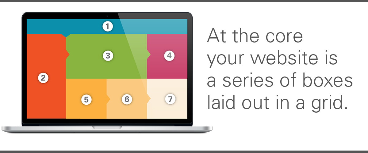
Let’s play pretend and imagine that your website as a series of boxes. Each box has a number—“1” for the header, “2” for the sidebar, “3 & 4” for banner images, and so forth across and down the page.
Here, I will make it easy:

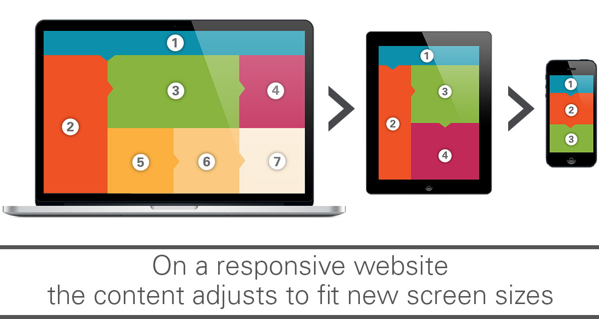
When it comes time to adjust those boxes to fit on tablets, phones and the myriad device types out there, the boxes must maintain their order—1..2..3. They are, in effect, glued to each other. You can make them bigger or smaller, you can switch around colors, fonts and the like. You can even make a section appear to disappear entirely. But you generally can’t rearrange the order of the boxes.
Let’s take a look at how this works.

The above graphic depicts a fairly standard breakdown of a responsive website. As you can see, the flow of content from one screen to the next remains constant. However, the size and shape of each content block does not.
You will also probably notice one other major fact…
You can’t have it all
As the screen size is reduced, the less content you can see. This makes it more important to keep key information toward the top of the page.
This is also a case for removing some content from the page entirely or condensing sections into expanding menus. But that is a topic for another blog post.
Let’s look at some common questions we receive from clients, co-workers and our parents about designing responsive websites:
Responsive Design FAQ
Q: Can I remove something so that it doesn’t show up on certain screen sizes?
A: Yes. It’s common to hide items, such as ad blocks and extra graphics from showing up on mobile devices. This can help streamline webpages when viewed on mobile that would be extremely long and unwieldy otherwise.
Q: Can I move a section of content to a new area of the webpage?
A: Generally no. It is best to keep content in the same order on all screen sizes. Currently the only ways to change the order of content are not fully supported by some browsers. Plus, it should be noted that the additional development time needed to do this can add significantly to the cost of any web development project.
Q: Why is the navigation hidden on mobile?
A: Navigation can take up a lot of space on small screens. If you have more than two or three items in you navigation, it is highly likely that the mobile experience will feel like nothing but links. To combat this problem the hamburger menu, fly-out menu, dropdown menu, hidden nav—whatever you want to call it—was born. Putting the website’s navigation behind a menu button frees up space on the screen and allows greater amounts of content to show.
Interestingly, this method for handling website navigation on mobile devices is beginning to trickle into desktop renditions of some major websites. You may soon see hamburger menus all over, and not just on your smartphone.
Q: Where is/what is the fold?
A: The fold is an old newspaper term for what is visible on the front page, above the…you know, fold. In digital it has come to represent the imaginary line that divides the top area of the page when the user immediately sees upon loading the page, and the bottom section that they must scroll to see. Where the fold is located can vary greatly from screen to screen, so don’t depend too much on it. Think of the fold as a guideline that can easily be crossed.
If you would like to know more about the fold, take a gander at my previous post, “Forget the Fold. Embrace the Scroll.”
Q: Should I include a back-to-desktop button for mobile users?
A: This is a tricky question. Ideally you would never need any type of button to let a user view the desktop version of the website because a responsive website is the same website with the same content. However, if you removed important content from being viewed at mobile sizes you may need to consider the option.
Q: the picture I’m using for my banner image has words on it that are too small on smartphones, what do I do?
A: There are multiple choices when it comes to this problem. One of the more common methods is to do what is known as an “image replace”. What this does is replace your banner image with another image that is more mobile friendly. However this comes with a major drawback. Each time you update the banner, you need to make two separate images.
Do you have a question about the mechanics of responsive web design? Leave your question in the comments section below.
