Does “Above the Fold” Matter Anymore?
Yes! “Above the fold” is a concept taken from newspapers to describe content featured in the top half of the front page. That informational hierarchy is still relevant in web design today – here’s how to put it to good use.
What Does “Above the Fold” Mean?
The term “above the fold” originally referred to newspaper design, where the content above the fold in the paper could be seen from newsstands, making it the most important part of the design.
So, what is “above the fold” on a website? In the digital age, content is above the fold when users don’t have to scroll to see it on the landing page. This new “above the fold” meaning informs how website design interacts with user engagement.
How to Design “Above the Fold”
When approaching a website or landing page design, you need to figure out the screen size most of your users use to know what’s above and below the fold. This information can be found in Google Analytics or another analytics tool. Knowing the screen size most visitors use to view your site allows you to design a site that works best for most users.
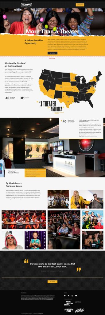
Viewable content can change by device; check important pages on your website to see “above the fold” size on desktop, mobile and tablet screen dimensions.
The most important thing when designing above the fold is to keep this area clear and concise. The best design does not try to cram everything above the fold – keep in mind that interested users are going to scroll to find additional information.
When planning above-the-fold optimization, think about what you want users to see first: your navigation bar or menu, your company name & logo, contact information and expressive imagery are all common above-the-fold content. Details about your company, services offered, reviews, more images, video content and contact information can all go below the fold.
Does Your Form Have to Be Above the Fold?
Depending on what you’re offering, your form does not always need to be above the fold. The location of your form should be dictated by the amount of information a user needs to commit to a formfill.
For example, if you’re looking to purchase a house, you’ll want to read through all the details of the home and see pictures before you’re willing to book an appointment to see it. On the other side of things, if someone is looking for a handyman to give an estimate on a project, your booking form can be above the fold because the user needs less information and is more likely to want to fill out the form sooner.

However, you should always aim to have some primary call-to-action higher up on the page, whether it’s a phone number or a link to a form.
Modern Designers for Modern Audiences
We’ve been around for more than 20 years, meaning we’ve been rolling with the changes in website design for a while. From re-platforming your existing site or creating a new digital identity, Oneupweb can help with a range of professional marketing services tailored to your needs.
Looking for someone to design the perfect website? Reach out online or call us at (231) 922-9977.