Web Form Design Best Practices
Poorly designed forms ruin the customer experience and negatively impact conversions.What makes an ineffective form and why are they frequently a barrier for users?
What can you, the site owner, do to design better forms? We’ve got a few ideas.
5 UX Best Practices for Forms
Effective form design isn’t necessarily hard, but it does require careful thought – and a little testing. To design a form that’s user-friendly and easy to complete, follow these website form design best practices:
- Clearly tell the user what is expected of them.
Indicate the expected format, as well as which fields are optional versus required. Use styles that tell the user when a box is clicked or when an item was missed or incorrectly entered. - Don’t get cute with form layout.
Stack form items rather than setting them side-by-side. Place form labels outside of your form input box, with labels above and hint text below. - Focus on accessible form design. Form input boxes should be navigable by keyboard, colors should meet a 4.5:1 contrast threshold, labels and hint text must be readable by a screenreader and text must be at minimum 14pt.
- Mobile-friendly is user-friendly.
Ensure the right keyboard appears for the right kind of form and use large form input boxes so they’re easily tappable with large fingers. Ensure your form breaks down appropriately at small sizes and set type sizes to at minimum 14pt. - Quick-loading forms are the way to go.
Make your form as fast and simple as possible with as few form items as necessary. Integrate smoothly with autofill or other browser-native speedy features. Consider a few small animations or transitions to help the user know they’re doing things right and to make the experience feel faster!
Let’s dive into more depth for each website form design recommendation.

Set Clear Expectations for Your Users
You’ve just finished filling out a form. It’s an important form. You’ve had to dig up your license for this form! But you’ve done it. You hit submit and are ready to be done with this nonsense.
ERROR ERROR!
At the end of the day, a form stands between the user and the thing they want. The best web form design is one that is simple to follow and leaves the user confident that it worked. Don’t make users second-guess what information is required or what they might have done wrong:
- Clearly indicate required information.
Luckily, we’re a few decades into this internet business, so most people know a little asterisk next to a label means “this one’s a must-do.” Simple as that. - Use red to indicate where an error happened.
While you can mix up what color you use to fit your brand, red is by far the best to stick with. It will most likely stand out from your brand palette and catch the eye of your user. When indicating what was missed, consider a treatment around the form input box (e.g., a thick outline, a red glow) and highlight the label in red. - Give the user a hint before and after the error
Your form input box should come with an example that tells the user the expected format. So, for example, if you must have dashes in your phone number, you should have text below your form input box that says ex: 555-555-5555. When the user commits an error, you should reiterate the expected format, and if possible, tell them what they were missing.
The Best Form Design Follows a Simple Layout
When it comes to designing forms, keep it as simple as possible.
You can get creative with some things — the page itself, how it animates in, how the form animates and how the brand is applied. Components that are more about what’s around the form than the form itself. But, when we dive into the labels, form input boxes, hint text and buttons themselves, we can’t get too wild.
Straying too far from form layout best practices can create confusion at best. At worst it can make the form inaccessible, unfriendly on mobile or simply too confusing to interact with.
Here’s what you should do when you design a form:
Stack Your Form Input Boxes
We recommend vertically stacking your input boxes and your labels to create clear groups. It should always be obvious what label and hint text belongs to which form input box. A stacked form also allows for a shorter eyepath (how your eye travels across information from start to end). The eye has less searching to do when hopping from one input to the next. It’s a simple, downward flow.
Place Your Labels Above Input Boxes
Web design form principles tell us that most people recognize boxes as belonging with labels positioned above them. It also matches the general downward flow of stacked forms.
While we would not recommend ever putting the label to the left of the input box, there are rare times when it’s acceptable to put your form in a two-column layout. For example, if you have a contact form with only four input boxes, that’s not asking a lot of your user. It leaves a little more wiggle room to gently break a rule.
Place Your Hint Text Below Input Boxes
Hint text is the small text telling your user input expectations (we talked about it in the previous section.) Hint text has historically lived in the input box, but we’ve learned that’s not a good place for it. It’s not only an accessibility issue but also bad UX: when you click the input box or input your information, the hint text disappears.
Placing your hint text outside of the input box is a part of designing accessible online forms and means that it’s always visible. (Remember, it’s all about making it as easy as possible!)
Employ Form Accessibility Best Practices
If there’s one thing no one can afford to be nowadays, it’s inaccessible. That applies to your whole site design (and should apply to everything else), but it also specifically applies to your form. We can help you learn more about website accessibility standards to ensure your whole site works for everyone.
Form accessibility comes down to a few primary things:
Navigability with only a keyboard
Designing positive experiences on the web – form design included – means making a site that users can easily travel through without once touching the mouse. This is a standard accessibility practice that’s important for folks who struggle with or can’t use a mouse.
Your form should work exactly the same way. A user should be able to hit tab to travel from one item to the next, the down arrow to open dropdowns, and the spacebar to select items like checkboxes, radio buttons or submit. The tabbing method is often set up with screenreaders in mind so that as our user travels the page, each item is read aloud.
Color contrast & text size
Your entire website should meet the color contrast ratio 4.5:1, and that’s true of your forms as well. This means all text, even hint text, should be clearly visible on the background. If you’re not sure whether your colors pass, test them using WebAIM.org’s color contrast tool.
No hidden text or items hidden behind pop-ups
Many sites used to put hint text in an icon that triggered a pop-up when a user rolled over it. For folks with low vision or who struggle with motor abilities, directing a mouse over a small icon to reveal a pop-up that easily disappears is a big ask. And hiding the hint text behind a pop-up is taking the risk that some users won’t be able to find it at all. Hint text should be visible, easy to read, easy to see and short enough to read quickly.
Labels and text that are readable by screenreader
Another critical aspect of UX form design is the development that goes into creating it on your website. There are lots of special considerations that need to go into the code. These include making sure the right elements are in place for a screenreader to navigate the text, making sure the field that the user is interacting with is highlighted and many more.
Use Mobile Form Design Best Practices
“Mobile-first” design has become the standard for web designers, and for good reason. Mobile is a much harder platform to design for. You’ll need to ensure that all page elements work on a smaller screen and a more limited operating system.
Mobile form design follows the same principles: if a form works on mobile, it most likely works on desktop as well. The opposite isn’t always true. Ensure your forms are accessible on a small screen: that means enlarging tiny buttons and other interactable elements, keeping font size at or above 14 pt and making sure your layout doesn’t break on a phone. QA test your forms on a mobile phone and a tablet to make sure they follow mobile form best practices.
Keep Your Form Minimal and as Fast as Possible
The last thing anyone wants is to fill in a bunch of extra form inquiries that you never end up using. This includes everything from not asking for information you don’t need, making extra info an optional fill and combining input fields when possible (for example, asking only for a zip code instead of city, state, etc.). Trim down your form to make it fast to load and fast to fill out. Your users will thank you.
Form Design Look & Feel
Earlier, we said that creativity should be limited to a few select places. Check out how these web designers and developers have been adding a little creativity around their form.
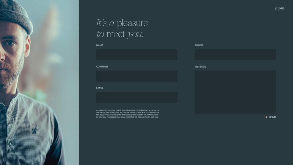
This lovely and simple form on Studio Chevojon checks all the boxes. This form meets color contrast ratios for the type against the background, the fields have the labels above them so the text doesn’t disappear and it’s a good example of a two-column form that works well for the user.
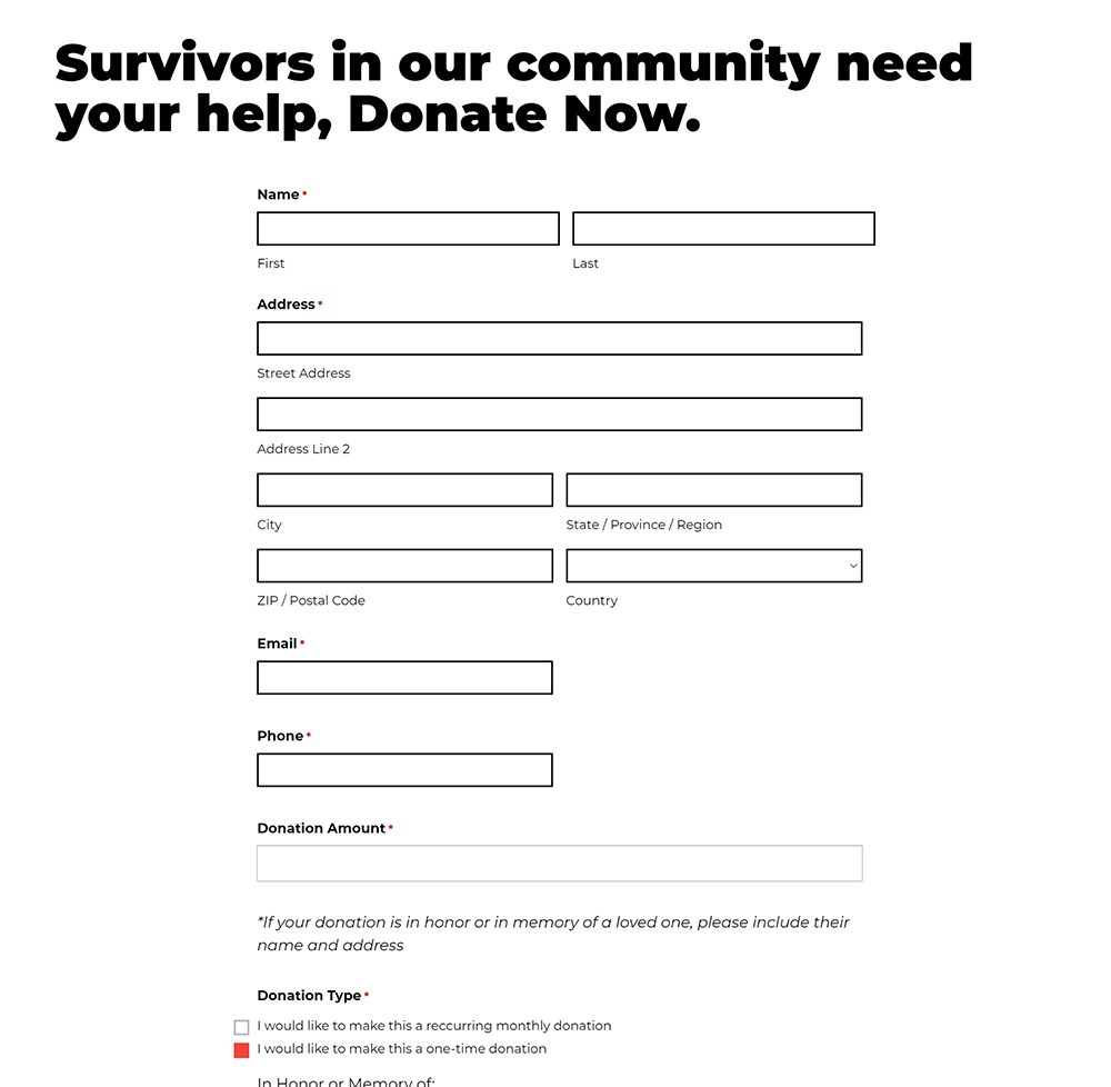
The donate form for the Women’s Resource Center is very straightforward, but – paired with high contrasting color and thoughtful typography – shows that a form can be beautiful as well as functional. Again, the labels and hint text are always accessible and don’t disappear when the user starts to type in the field. It’s easy to navigate and complete, creating a low barrier to receiving donations.
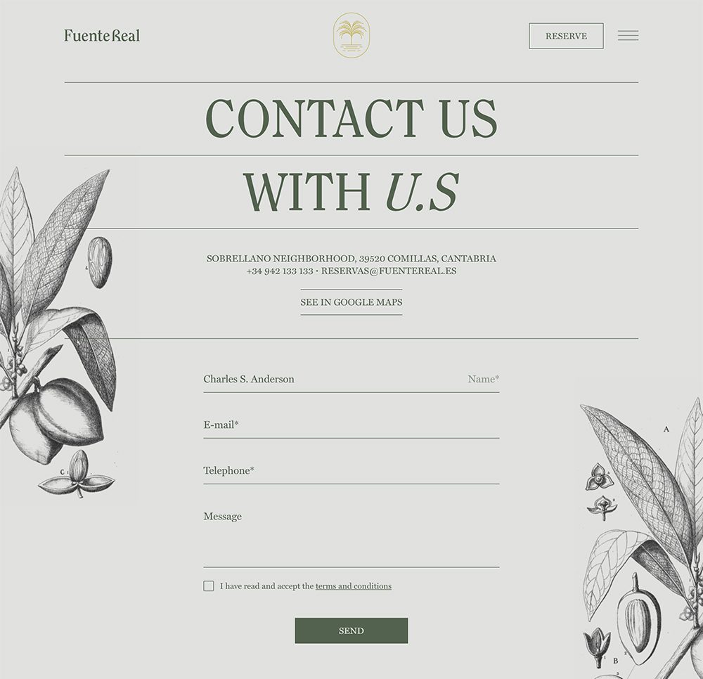
This beautiful and unique contact form seems to break the rules, but doesn’t! FuenteReal’s form has the labels in the field, but when you select it to enter your information, it slides to the right and remains visible! This creative form shows how design and development work together to create a form that isn’t cookie-cutter.
Asking Experienced Designers for Support
For something that seems so straightforward, there are a lot of small components to creating forms in a way that encourages, not discourages, a user to submit. And it can be really tricky! So, if you need help creating a form that best meets the goals you and your users share, reach out online or call (231) 922-9977 to get in touch with our experienced web form designers.