Responsive What, Responsive Who?
I’ve been speaking with several people in the higher education market, and a topic that keeps coming up is mobile marketing and a need to reach a mobile audience. Whenever I have this discussion, one of the first questions I ask is whether the website is “responsive.” Sometimes, they don’t know what that really means.
What is responsive design?
Responsive design is the technical means used to ensure that your web properties properly render and remain actionable across every platform. Responsive design means that your website is user-friendly and conversion-ready no matter what device is used to view it, whether it be a desktop (large screen), laptop (medium screen), tablet (small screen) or smartphone (downright tiny screen).
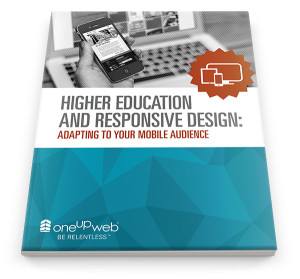
Here’s an excerpt from one of our recent white papers, Higher Education and Responsive Design: Adapting to Your Mobile Audience:
Even if your university does not currently offer online learning options and is grounded in traditional means to deliver education to your student body, you cannot escape the fact that online learning is here to stay—and it’s mobile; your students won’t be limited to simply using desktops and laptops.
Consider:
- 91% of students use email to communicate with professors
- 65% u
se digital devices to complete school work
- 98% of students who own an e-reader (such as a Kindle or an iPad) use it to read e-textbooks.
- Also, keep in mind that a vast majority of students—90% of them, in fact—use two or more devices.
The Internet is also changing the way students learn. A recent study projects that in 2014, 3.55 million students will take their courses solely online and 18.65 million will take at least one class online.
The shift to digital and the increasing importance of mobile accessibility make it imperative to review how mobile-ready and user-friendly your school’s web properties are. Having a sleek and aesthetic homepage is not enough anymore. Your homepage—including your school’s form fills, landing pages, and intranets all need to function in a way that meets the needs of your smartphone-carrying student body.
As a higher education institution, you need to reach as many stakeholders as you can. If your website is not mobile-ready, you’re not casting a wide enough net. Take a look at your digital properties and do a deep dive into the way your prospective and current students, faculty and other stakeholders are finding you online. If you’re not accounting for a mobile presence, you should be. Take some time to learn about how we market in the higher education industry. And download our latest white paper to find out more about responsive design.
 se digital devices to complete school work
