Whitespace or Dead Space: Beware the Horror Vacui of Web Design
Snakes, tarantulas, small enclosed spaces, the tallest heights, the blackest nights and whitespace. Some fears are so great that they have plagued mankind for centuries.
Whitespace may seem like an odd addition to this list, but I have seen many savvy business men/women fall prey to the horror vacui—the fear of empty space.
Don’t fear it—Say hello to whitespace
Before we go any further let’s define whitespace.
“Whitespace” (also called “negative space”) is all the space between elements in a composition. Whitespace is also something of a misnomer because it doesn’t need to be white. It can be any color or texture so long as it is absent of design elements (things like text, images or videos).
Whitespace can be large—such as the margins of a webpage—or whitespace can be very, very small—such as the space between individual letters in words.
Why you need whitespace
It’s tempting to fill every nook and cranny of a webpage. Many believe that every space should be used (and packed closely together) to promote the website’s content. However, filling every space can negatively affect the user. The page can quickly become overwhelming, heavy and directionless. After all, when everything is the most important thing on the page, nothing stands out.
The key is to strike a careful balance between the content of a webpage and whitespace. When done well, the benefits can be profound.
Here are a few of the benefits:
Improved legibility
The most important and obvious benefit of well used whitespace is improved legibility.
Ensuring the right amount of space between lines of text, proper line length, space around the paragraphs—all of this whitespace matters and makes a massive difference in the overall legibility of content.
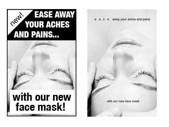
Let’s apply some well-balanced whitespace to some content to see how it affects the legibility:
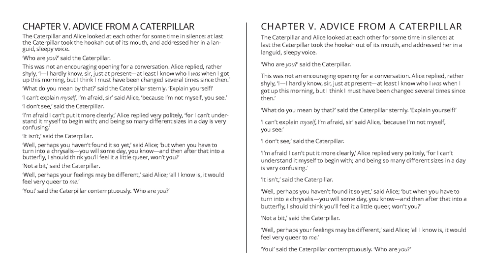
The example on the right is a little cramped and the paragraphs are difficult to tell apart. It is readable, but imagine reading page after page of content like this. After a while, it will cause some serious eye strain.
In the example on the left, we applied additional whitespace throughout the text. We expanded the space around individual paragraphs to help clearly delineate them. We also increased the leading (line-height) and made the type slightly larger. We also made multiple other small but significant changes. Each change helped make it easier to read and more balanced.
You might notice that the example on the left takes up more space. Luckily, this is okay because when it comes to the web, we can make pages longer so unlike a postcard, flyer, or other printed material where there is limited space. Online, we rarely need to cram content onto the page for the sake of space.
Higher comprehension
Well used whitespace around paragraphs and blocks of text can increase reading comprehension by 20%.
That is impressive. Empty space can make people remember your content better. But remember it isn’t just what you write—it is also the placement of images and other design elements that matter too. It all works together.
Increased attention
Want someone to zero in on a call to action or an important piece of content? Whitespace is a powerful way to attract the user’s eyes to it.
The immediate reaction for many when trying to add attention to content is to simply make it bigger, but adding whitespace often is more effective in (to use a term most designers find cringe-worthy) making it pop.
Added sense of elegance & sophistication (if that is what you are going for)
Whitespace is important when it comes to how your brand is positioned. As a culture, we associate brands who use lots of whitespace with quality, luxury, sophistication and elegance. Brands who use very little whitespace are associated with the opposite attributes. They are viewed as cheap, low-quality, unsophisticated, and inferior.
So when it comes to your brand, think about where it falls on the brand persona spectrum. You may not be Cartier, Bentley, or Burberry, but do you want to be Valutime, Pabst Blue Ribbon, or some other “bargain bin” brand?
So next time…
Your website is a battle ground between a multitude of elements, each one fighting for prominence over the other. But keeping them in line is a magical glue called whitespace that, when wielded correctly, can clarify and define your message—helping the dust settle and giving users a better web experience.