Mobile Optimization Tips for Your Website and Other Digital Content
When smartphones first came on the scene, businesses created pared-down versions of their standard websites and called them their mobile sites. It worked. For a while.
With the ever-increasing number of devices and screen types, mobile website optimization and design have become the default for all internet users.
Marketing on the Move: Mobile-First is a Must
More than 60% of Internet users browse on mobile devices, and the content on your desktop and mobile pages must be the same to be sure that you are serving all users the same information and maintain the consistency of your brand.
Mobile search optimization improves the user experience and keeps Google happy. The world’s largest search engine shifted to mobile-first indexing, which has been active for years and finished rolling out in 2021. This means your page rankings are based on your mobile page performance, making mobile optimization more critical than ever.
Prioritize How You Optimize for Mobile
Whether someone is browsing your site, checking your Facebook page or reading your emails on their mobile device, certain optimization factors are vitally important:
- Fast content load times – Google found that bounce rate increases by 32% between a page that loads in 1 second compared to a page that loads in 3 seconds.
- Clean page design – Keeps your site easy to navigate and helps users find the information they want.
- Quality counts – Create engaging, informative content that users love.
How to Optimize Your Website for Mobile Devices
Mobile optimization encompasses SEO, design and web development across all your marketing channels. All of these factors shape the effectiveness of your website, emails and other digital assets and can make or break your digital marketing strategy. We’ve broken down several mobile conversion optimization tips into a few categories
- Local Intent
- Mobile SEO
- Mobile Design
- Mobile Email
- Mobile Advertising
Localize to Optimize
Remember that mobile search results are not the same as desktop results. Mobile search results are heavily influenced by the user’s location.
Think about all the times you’ve pulled out your smartphone to perform “near me” searches (restaurants near me, putt-putt golf near me, etc.). Additionally, rich results in the search engine results page (SERP) – such as featured snippets or news carousels – are more common on mobile than desktop.
Because of those two key differences in the SERP, optimizing pages for localized and long-tail keywords is a great way to target mobile users.
Implementing structured data is another excellent mobile SEO optimization tactic if you want to capture more mobile users through rich results.
Related: What is Local SEO and Why Do I Need It?
Mobile SEO Best Practices and SERP Rankings
SEO is vital, but it won’t work unless the content is high quality. Always prioritize publishing helpful, engaging content. This is important for all users on all devices, but there are ways of writing that work well on mobile.
- Break up copy with sub-headers and bulleted lists to make the page skimmable
- Use keywords strategically. There’s no need to stuff as many keywords as you can onto a page. Instead, focus on writing natural, informative content that you’d want to read yourself – that’s all your audience wants!
- Use your keywords in the title tag, H1 header, and wherever they fit naturally in the copy. Don’t overoptimize!
Mobile Optimized Website Design
Mobile-responsive layouts provide a great user experience on mobile (and desktop) devices. Being mobile responsive means that your site will reformat itself based on the device someone is using as well as the size of their screen. This allows your website to display for smaller screens like smartphones or medium screens like tablets.
TIP: Give the layout adequate consideration during the planning stage, and make sure it’s designed thoroughly before development begins. Most website designers start with mobile these days!
Here are a few specific website design elements that require special consideration for mobile:
- Build a menu navigation that uses a hover state alternative, since hovering over menu items isn’t possible on mobile devices. Hamburger menus and scrolling panels are a couple of navigation options that provide good mobile UX.
- Reserve room for a bold CTA somewhere near the top of the page – but not necessarily above the fold. You often need a little space at the top of the page to explain context and value before you hit the reader with a CTA. At the same time, you don’t want to make mobile users scroll for too long before seeing an action point.
- Consider using sliders, accordions, and other design elements that give the user the option to view more detailed content if they want to. Some users will choose to skim the page and scroll quickly, while others will interact with the hidden content.
Other Page Speed Optimization Tips and Tools
Google’s May 2021 Page Experience algorithm update prioritizes Core Web Vitals performance metrics, which measure how smoothly and efficiently a page loads. Because of a mobile device’s dependence on networks to load data, this update is expected to have a bigger impact on mobile users than desktop users.
When optimizing an existing website for mobile speed, check for crawl and speed issues specific to mobile users. Google provides several helpful (and free!) tools for testing page speed. One of our favorite tools is Google Search Console, which provides a list of pages with Core Web Vitals and Mobile Friendly issues.
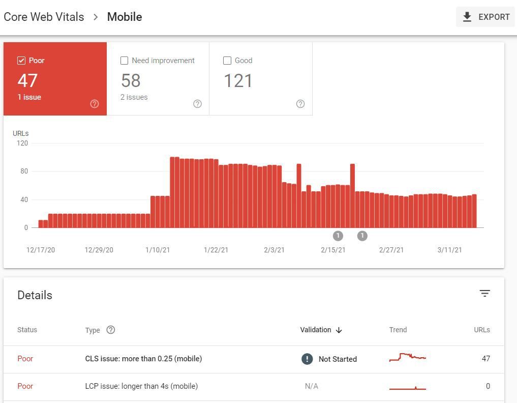
The website tested in the example below has problems with cumulative layout shift (CLS), which means elements on these pages don’t load synchronously, leading to content unexpectedly shifting around before the page is fully loaded:
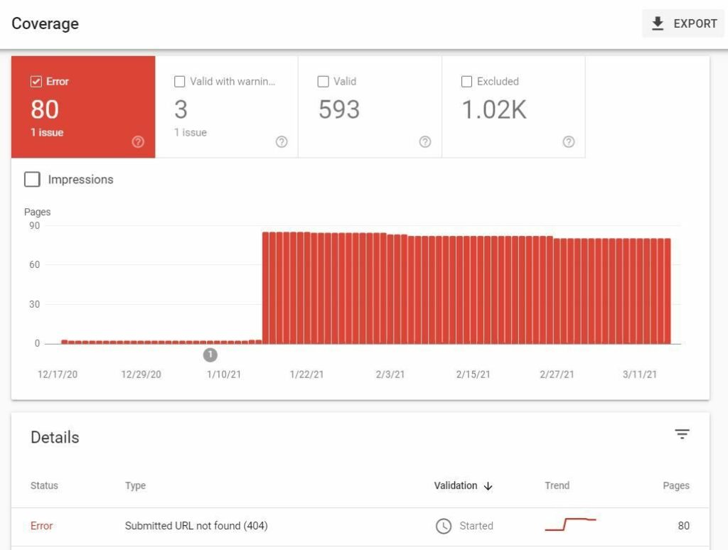
You can also identify problems like missing pages (404 errors) and pages with warnings in the Coverage report:
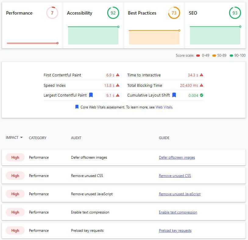
Google’s Lighthouse test measures a website’s mobile performance and pinpoints the problems that tend to repel mobile users. The page tested below performs well for accessibility and SEO, but work is needed to improve page speed and visual stability, shown here as “Performance”:
Mobile-Optimized Email Design and Strategy
Sending mobile-friendly emails has also never been more important. While more than half of emails are opened on mobile devices, an organization’s industry may have a huge impact on mobile email readership. The highest mobile email readership is 60% for companies in the leisure, sports and recreation industry; the lowest is 38.2% for schools and other education organizations.
While the text you write certainly matters, design and development matter the most when it comes to knowing how to optimize email for mobile. Clunky, poorly designed email templates can sink your campaigns faster than poorly written email copy.
Related: What is Email Marketing?
Designing for Mobile Inboxes
- Implement responsive email design so your emails provide a user-friendly experience on all mobile devices.
Drag-and-drop templates from many email marketing platforms are responsive and help prevent issues such as text boxes or images that are too wide for screens. Additionally, responsive email design leads to 15% more clicks from mobile users.
- Reduce image sizes whenever you can. This will help your email load faster on mobile devices.
- Be sure all text and buttons are large enough to be seen on any mobile screen.
- Don’t place clickable elements (such as buttons and links) close to each other. This prevents users from accidentally tapping on the wrong element on their smartphone.
- Use Google Analytics to figure out which mobile devices your audience uses the most. Then, you can run future emails through a testing tool (such as Email on Acid) to make sure your content and design will provide the best possible user experience on those devices.
- When in doubt, test it out. Tell your email platform to send a test email to yourself and open it on your smartphone. See how long it takes for the email content to load. Pay close attention to the size of each element in the email. Try clicking around – will “fat finger” be an issue for your users?
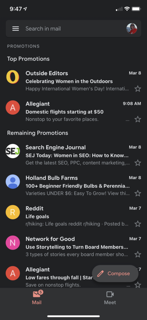
Here’s one more tip: Make sure your email design is compatible with Dark Mode. This is an increasingly popular setting on mobile (and desktop) devices that alleviates eye strain. Setting up your emails for Dark Mode users may entail updating your code to ensure your email’s appearance stays consistent, regardless of what email client or settings each user employs.
If you haven’t discovered Dark Mode yet, it’s worth a try. Once you make Dark Mode a preference in your phone’s settings, new apps that are Dark Mode-compatible can automatically select this theme for you. Here’s what Gmail looks like in Dark Mode on a mobile device:
Mobile Advertising Optimization
Running paid ads can be an effective way to support your ecommerce goals and promote brand awareness. But just like everything else, your ads will be experienced differently on desktop and mobile devices. Here’s how to get the best possible results from your mobile-optimized ad campaigns.
To run mobile-optimized ads in Google search, consider these tips:
- Use expanded text ads. These provide more room for text in the ad and provide optimal performance for mobile users.
- Implement ad extensions to display additional information, such as your company’s phone number or page links, in your search ads.
- Remember that the third headline in a standard search ad is often hidden on mobile – use this area for nonessential information.
Here are some strategies for creating optimized mobile display ad campaigns:
- Each platform has its own requirements regarding image size and text ratios, so be sure to follow the image guidelines set forth for the platform you’re using (e.g., Google, Facebook, Instagram, Twitter, etc.).
- Test image ads and responsive ads in multiple sizes and formats to achieve more conversions.
- Experiment with automated bids and audience targeting to achieve higher volume with your display ads.
- Be cautious about placing ads on mobile apps. For many companies, placing display ads in an app gets a lot of impressions and false-clicks, and is therefore not a productive placement option. App placement can be excluded but has to be done through the Google Ads desktop app, rather than the web interface.
Adhere to these guidelines for all ad types:
- Devise iterations of each ad and test, test, test until you land on an ad that knocks it out of the park. The same goes for audience targeting. Make adjustments until you’ve got it dialed in.
- Monitor device type performance. If mobile vs. desktop performance varies significantly from paid users to paid converters, then it could indicate issues with mobile user experience. If the ratio of desktop vs. mobile vs. tablet users who click on paid ads changes substantially, it can be a predictor of a coming behavior change. For example, we observed such major consumer behavior shifts at the beginning of the Coronavirus pandemic.
- Create dedicated landing pages for ad campaigns. Make sure the style of the landing page and ads match each other. Make the user funnel and call-to-action on the landing page crystal clear. And of course, make sure that landing page is optimized for mobile! When creating new landing pages, refer to the Website Tips section for more helpful guidance.
- Confirm that you’re tracking conversions accurately.
- Make sure your ad copy is compelling and creates a sense of urgency.

Create Superior Mobile Experiences
Thanks to SERP rankings being solely determined by mobile performance, mobile-based marketing is only going to become more competitive over time as competing businesses try to out-mobile-optimize each other. Plus, the average user’s attention span will only become shorter as mobile experiences improve across the board. Getting support from mobile optimization experts can help your business succeed in this challenging space.
Digital Marketing for Organizations on the Move
Oneupweb knows what it takes to stay on the cutting edge of mobile optimization. Let our team devise a strategy to keep your organization competitive in all things mobile. Find out what more than 20 years of experience can do for you. Give us a call at (231) 922-9977, or complete our contact form today.